UX Student Project
Launch is a task management, responsive website I designed while a student under the mentorship of two UX designers. It is my first UX design project.

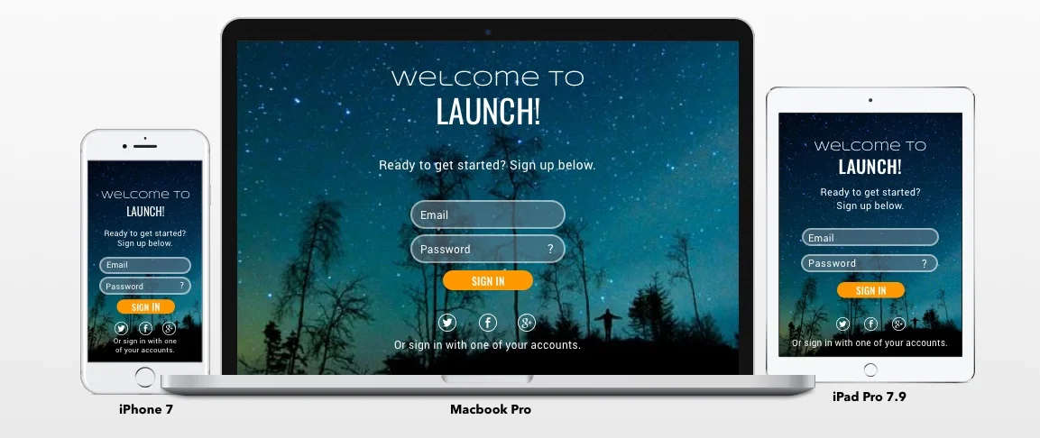
The challenge of the project was to build a responsive website for a client that offers task / project management software as service. During the project, I learned about the benefits and importance of mobile first design. Also, I learned how to persuade the imagined client that a mobile first responsive website was the best choice for this application. Failure to do that would either prevent or delay the client from achieving their business goals. Also, my initial research indicated that users required mobility and synced access across platforms and devices. A responsive website was the best option that met the user's needs and the client's goals.

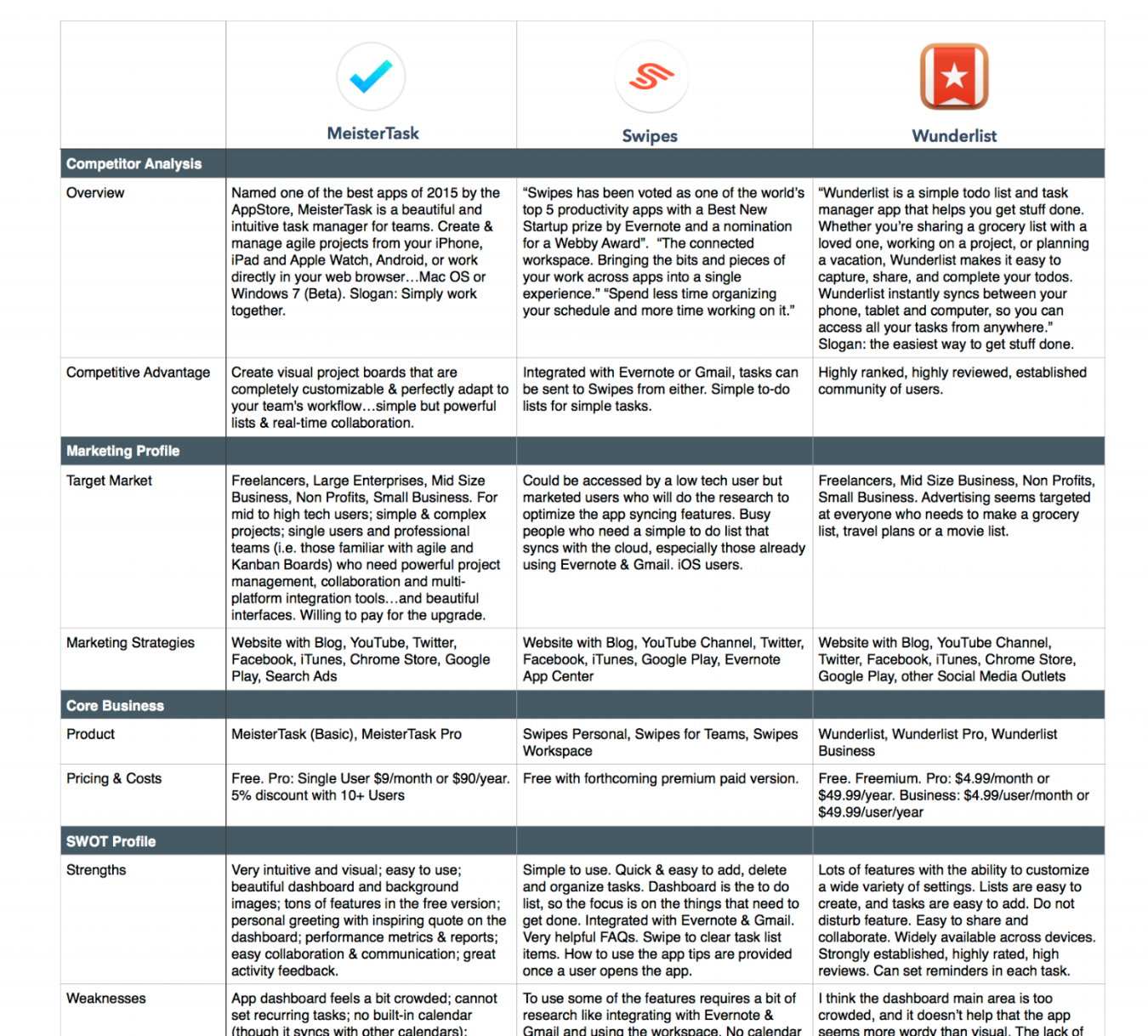
Upon receiving the "client's" requirements, I started this project with the discovery phase, which included an analysis of competitors, the identification of potential users, and an understanding of the needs and goals of those users. The goal of my research, user survey, and user interviews was to envision the competitive advantage that best met the user’s real needs. User research also gave me real data upon which I would base my designs. From the big picture perspective, the synthesis of Launch's competitive advantage with the real needs of users would be a win-win solution for the client and the user.
TOOLS: SurveyMonkey and Interpersonal Interviews

Based on my discoveries, I conceptualized the ideal target audience, defined their needs, and ideated ways the product could meet those needs. I created user personas and decided upon the essential elements the product needs to be viable on the market (MVP). My concepts and decisions emerged from deep reflection on the research. During reflection, I shift perspectives, interrogate the data, and let my imagination explore possibilities. Then I eliminate possibilities and make decisions based on what will be the most effective approach.
Ideal users were active people with busy lives needing a way to organize their work and personal lives. Basically they needed to connect with their teams, assign and track tasks, and manage their personal and family schedules. The three personas I created gave substance, personality and context for my concepts.

How will users quickly and easily find the content for which they are searching? Organizing the information and content related to Launch was the next challenge. Again, I took a user-centered approach. I conducted a card sort with users to see how they organize and name the content and categories. From that, a simple site map was created using categories named by users. After interpreting user feedback, I made the above site map.

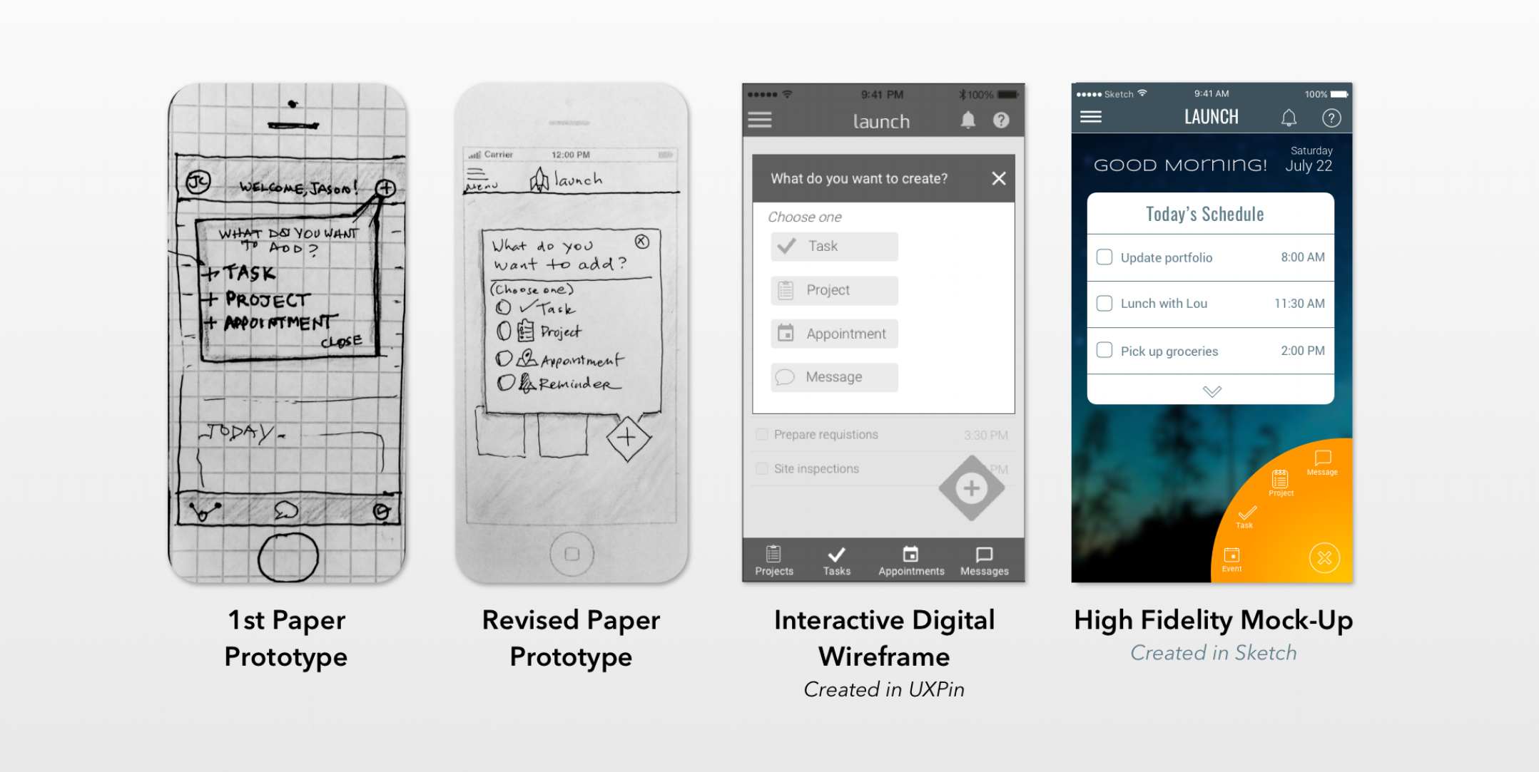
The interfaces underwent numerous iterations as user feedback was integrated into each redesign. I began with paper prototypes to save time and costs before building the wireframes. Paper prototypes were easy to test for feedback early in the design process.
Once I started the wireframes, I began to develop the tablet and desktop versions. I uploaded all the wireframes into InVision to make them interactive, so that I could test the user flows in a digital format. I gave instructions to users for actions I wanted them to accomplish in the test. I wanted to see where they hesitated, were confused, or frustrated. Their feedback was used to further refine the product.
TOOLS: UXPin, InVision, Sketch

This is an early paper prototype for the steps required to create a new a task in Launch. For familiarity, I borrowed from iPhone's "New Event" form in the iCalendar. As mentioned above, the prototypes were tested by users to reduce pain points and confusion.

These are the last iteration of the wireframe designs. It also shows the steps required to create a new task process like the paper prototypes above. However, this includes more details added to the new task, They were designed in UXPin.

A professional, modern style was chosen for Launch because I wanted the user to feel empowered to manage each day's competing priorities. Elements were chosen according to visual and emotional design principles that communicate strength, trust, simplicity and cleanliness with a dash of style. However, I realized that professional and modern styles can feel cold and intimidating. Therefore, I softened the design with light-weight icons, the reduction of harsh contrasts, and warm orange accents to create a friendly feel. The UI Kit and style guide also became Launch's brand. Both the UI and brand were designed to further user experience strategies.
TOOLS: Sketch

Once my design ideas had been adequately tested and refined, I designed high fidelity mockups in Sketch to which I applied the UI Kit, style guide and brand. To achieve this design, my process was mostly intuitive. By intuitive, I mean that I let all my knowledge, up to that point, brew in my mind so a vision could emerge that achieved a synthesis of heuristics, research, and the goals of Launch.

The user experience extends beyond the product's launch. It begins when they first discover the product and continues as long as they decide to use it.
To advertise and attract users to Launch, I designed a website consistent with the brand. The goal was to keep it simple and provide the most compelling content, so traffic would easily engage with and sign up for the free version of the application.
Once built, I connected the site to Google Analytics to collect data and gradually optimize the website's performance and use over time. By monitoring data, adjustments can be made to the site improve performance and use.
Finally, I recommended strategic actions to acquire, engage, and retain users so that the client could generate revenues to meet their business goals.
TOOLS: Wix & Google Analytics

This project, along with mentorship, equipped me with the mindset, technical skills, techniques, and methods of UX design. Also, by following the UX process from start to finish, I learned how to think holistically about the product, the business goals, and user needs, and how to synthesize these three into strategic, intuitive, and beautiful user-centered designs.
